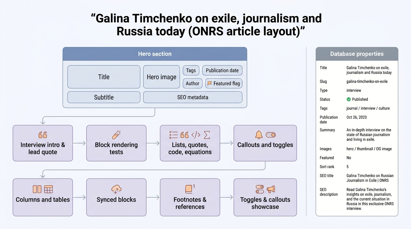
Interview format test
This article body is intentionally varied so the backend can fetch rich Notion blocks before the Astro renderer exists.
Independent media in exile is not only a question of publishing. It is a question of audience, trust and institutional memory.
Editor notes
This nested paragraph should be returned under the toggle children array.
Block rendering test
A grab-bag of Notion blocks for visual testing.
Headings
Heading 1
Heading 2
Heading 3
Heading 4
Text formatting
Plain paragraph with bold, italic, strikethrough, underline, inline code, and a link.
Inline color examples: red text, green background, purple text.
Inline math: E = mc^2 and \int_0^\infty e^{-x^2}\,dx = \tfrac{\sqrt{\pi}}{2}.
Lists
- Bulleted item one
- Bulleted item two
- Nested bullet
- Deeper nested bullet
- Nested bullet
- Bulleted item three
- Numbered item one
- Numbered item two
- Nested numbered
- Nested numbered
- Numbered item three
To-dos
Quotes
A single-line quote block.
Multi-line quote: Line two of the quote. Line three with bold and italic.
Divider
Code
def greet(name: str) -> str:
    """Say hi."""
    return f"Hello, {name}!"

print(greet("Alex"))flowchart LR
A["Start"] --> B{"Decision?"}
B -- Yes --> C["Do the thing"]
B -- No --> D["Skip it"]
C --> E["End"]
D --> EEquation block
\hat{\beta} = (X^\top X)^{-1} X^\top yCallouts
Toggles
Click to expand a regular toggle
Hidden content inside the toggle. Supports rich text and nested blocks.
- Nested bullet inside toggle
- Another bullet
Toggle heading
Content revealed when the toggle heading is opened.
Quote inside a toggle heading.
Columns
Left column
- Point A
- Point B
- Point C
Middle column
Right column
- First
- Second
- Third
Table
| Item | Status | Owner | Notes |
|---|---|---|---|
| Hero image | Done | Alex | Uploaded to CDN |
| SEO copy | In progress | Alex | Draft pending review |
| Transcript | Blocked | Editorial | Awaiting approval |
Image
https://picsum.photos/seed/onrs-test/1200/600
Table of contents
Paragraphs of different sizes
Short.
A single, slightly longer sentence to test how a one-liner wraps inside the article column.
A medium-length paragraph that runs across two or three lines on most screens. It exists to check line-height, hyphenation behaviour, and how body copy sits next to headings and callouts above. Nothing here is load-bearing — it is just enough text to fill the reading width comfortably without spilling into a wall of prose.
A longer paragraph designed to stress-test typography across a wider range of widths. Independent journalism in exile, like the kind discussed in the interview above, often depends on infrastructure that is invisible to readers: secure publishing pipelines, distributed editorial teams, redundancy of hosting, and a careful approach to source protection. When we render long-form articles on the ONRS website, we want body text at this length to remain readable on both narrow mobile viewports and wider desktop columns, with consistent spacing above and below adjacent blocks such as quotes, callouts, and images.
And finally, a substantial block of prose to see how the renderer behaves when a single paragraph carries real weight. The history of Russian-language independent media is, in many ways, a history of relocation — of newsrooms reconstituting themselves in Riga, Berlin, Tbilisi, Amsterdam, and elsewhere, often more than once. Each move brings with it a fresh set of legal, financial, and editorial constraints, and yet the core editorial mission tends to survive: to document, to verify, and to publish without flinching. For a site like this one, which sits somewhere between a cultural hub and an editorial outlet, getting the long-paragraph reading experience right matters as much as the headline image or the table of contents above. Spacing, measure, leading, and the relationship between paragraphs and the surrounding blocks all contribute to whether a reader stays with a piece to the end — or bounces after the first scroll.
Nested block combinations
Callout inside a toggle
Expand to see a callout
A paragraph after the callout, still inside the toggle.
Toggle inside a callout
Nested toggles (three levels)
Level 1 toggle
First level content.
Level 2 toggle
Second level content with a quote:
A quote inside a nested toggle.
Level 3 toggle
Deepest level. If you can read this, three-level nesting works.
Colored blocks
Plain paragraph, no colour.
A gray paragraph for secondary information.
A red paragraph for warnings or errors.
A blue-background paragraph for info highlights.
Colored heading
- Orange bulleted item
- Green-background bulleted item
- Red numbered item
- Purple numbered item
A brown-background quote for editorial aside.
Multi-language code blocks
const fetchArticle = async (slug) => {
  const res = await fetch(`/api/articles/${slug}`);
  if (!res.ok) throw new Error(`Article not found: ${slug}`);
  return res.json();
};.article-body {
max-width: 42rem;
margin: 0 auto;
font-family: "Georgia", serif;
line-height: 1.7;
color: var(--text-primary);
}
.article-body blockquote {
border-left: 3px solid var(--accent);
padding-left: 1rem;
font-style: italic;
}#!/bin/bash
curl -s "https://api.notion.com/v1/pages/$PAGE_ID" \
-H "Authorization: Bearer $NOTION_TOKEN" \
-H "Notion-Version: 2022-06-28" | jq '.properties.Title'SELECT a.title, a.author, a.publication_date
FROM articles a
JOIN tags t ON t.article_id = a.id
WHERE t.name = 'culture'
AND a.status = 'published'
ORDER BY a.publication_date DESC
LIMIT 10;Synced block
This is a synced block. Any copy of this block elsewhere will mirror these contents automatically.
Columns with complex children
Stats
| Metric | Value |
|---|---|
| Articles | 47 |
| Interviews | 12 |
| Languages | 3 |
Key quote
Memory is a form of resistance — it refuses to let history be rewritten.
Deeply nested list
- Level 1
- Level 2
- Level 3
- Level 4 — this tests deep indentation
- Level 5 — maximum practical depth
- Back to level 4
- Level 4 — this tests deep indentation
- Back to level 3
- Level 3
- Back to level 2
- Level 2
- Another level 1 item
Quotes in all sizes and colours
Default (no colour)
A quote with no colour applied — the default style.
Text colours
Gray text quote.
Brown text quote.
Orange text quote.
Yellow text quote.
Green text quote.
Blue text quote.
Purple text quote.
Pink text quote.
Red text quote.
Background colours
Gray background quote.
Brown background quote.
Orange background quote.
Yellow background quote.
Green background quote.
Blue background quote.
Purple background quote.
Pink background quote.
Red background quote.
Multi-line quotes
Multi-line default quote: Second line of the quote. Third line with bold and italic.
Multi-line gray quote: Line two. Line three.
Multi-line blue background quote: Line two with inline code. Line three with strikethrough.
Quotes with rich formatting
Bold quote with italic and code inside.
Quote with E = mc^2 inline math and a link.
Strikethrough quote with underline text.
Red inline text inside a blue inline text quote.
Attributed quotes
Memory is a form of resistance — it refuses to let history be rewritten.
The limits of my language mean the limits of my world.
In a time of deceit, telling the truth is a revolutionary act.
A language is a dialect with an army and a navy.
You can cut all the flowers but you cannot keep spring from coming.
The struggle of man against power is the struggle of memory against forgetting.
To be yourself in a world that is constantly trying to make you something else is the greatest accomplishment.
Not everything that is faced can be changed, but nothing can be changed until it is faced.
One's destination is never a place, but a new way of seeing things.
One's destination is never a place, but a new way of seeing things.
Links in different colours
Default link: Notion homepage
Text-coloured links
Background-coloured links
Mixed formatting with coloured links
A paragraph with bold red link, italic blue link, and green background link with code inline.
Quote with a red link and a blue background link inside.
Footnotes test
Independent media in exile is not only a question of publishing.^{[1]} It is a question of audience, trust and institutional memory.^{[2]} When newsrooms relocate, they must rebuild not just infrastructure but credibility^{[3]} — a process that can take years and is never truly complete.
The concept of "media in exile" has deep historical roots.^{[4]} From samizdat to satellite broadcasts, the mechanisms change but the core tension remains: how to reach an audience that the state would prefer stayed uninformed.^{[5]}
Galina Timchenko has argued that solidarity between exiled outlets matters more than competition,^{[1]} a view shared by several other editors-in-chief across the diaspora.^{[6]}
References
- Timchenko, G. (2024). "Building Meduza from scratch." Press Gazette, 12 March 2024.
- Khodorkovsky, M. (2023). "Institutional memory and the Russian free press." Open Russia Papers, vol. 7, pp. 14–31.
- Lipman, M. & McFaul, M. (2022). "Media credibility after relocation." Journal of Democracy, 33(2), 89–104.
- Stelmakh, V. (2019). "Samizdat to servers: a short history of exiled publishing." Slavic Review, 78(1), 201–218.
- RSF (2023). "Press freedom and digital reach in authoritarian states." Reporters Without Borders annual report.
- Galperovich, D. (2024). "Cooperation over competition: voices from the Russian media diaspora." The Moscow Times, 5 June 2024.
Toggles showcase
Plain toggles
Simple toggle with plain text
Just a paragraph inside a basic toggle.
Toggle with bold and italic summary
Rich text in the summary line tests whether the renderer preserves inline formatting on the toggle label.
Toggle with multiple children
First paragraph inside the toggle.
Second paragraph — checking spacing between siblings.
- A bullet list
- Inside a toggle
- And a numbered list
- Right after it
Empty toggle (no children)
Coloured toggles
Blue text toggle
Content inside a blue-coloured toggle.
Red text toggle
Content inside a red-coloured toggle.
Green background toggle
Content inside a green-background toggle.
Purple background toggle
Content inside a purple-background toggle.
Orange toggle with rich children
A quote inside an orange toggle.
- Orange bullet
Toggle headings (all levels)
Toggle Heading 1
Content under a toggle H1. This is the largest toggle heading.
A second paragraph to test spacing.
Toggle Heading 2
Content under a toggle H2.
- Bullet inside toggle H2
- Another bullet
Toggle Heading 3
Content under a toggle H3.
A quote inside a toggle H3.
Coloured toggle headings
Red Toggle H1
Content under a red toggle H1.
Blue Toggle H2
Content under a blue toggle H2.
Green background Toggle H3
Content under a green-background toggle H3.
Nested toggles
🗂️ Level 1 — Project overview
This is the top-level project overview.
📋 Level 2 — Milestones
🎯 Level 3 — Beta details
Beta testing starts next week. Key metrics:
| Metric | Target |
|---|---|
| Response time | < 200ms |
| Error rate | < 0.1% |
| User satisfaction | > 4.5/5 |
🔬 Level 4 — Test matrix
Browsers: Chrome, Firefox, Safari, Edge
Devices: Desktop, tablet, mobile
🐛 Level 5 — Known issues
Toggle with complex children
Toggle containing a code block
interface FootnoteRef {
  id: number;
  text: string;
  source: string;
}

function renderFootnote(ref: FootnoteRef): string {
  return `<sup><a href="#fn-${ref.id}">[${ref.id}]</a></sup>`;
}
Toggle containing an equation
\nabla \times \mathbf{E} = -\frac{\partial \mathbf{B}}{\partial t}Maxwell's third equation — Faraday's law of induction.
Toggle containing an image
https://picsum.photos/seed/toggle-test/800/400
Caption text below the image, inside the toggle.
Toggle containing columns
Left
Some content on the left side of columns inside a toggle.
Right
Some content on the right side of columns inside a toggle.
Toggle containing a callout with a nested toggle
Toggle heading with nested toggle heading
Outer toggle heading
Content under the outer toggle heading.
Inner toggle heading
Content under the inner toggle heading — nested toggle headings.
- A bullet for good measure
Side-by-side toggles in columns
📘 Column 1 toggle
Toggle content in the left column.
- Item one
- Item two
📙 Column 2 toggle
Toggle content in the right column.
A quote inside a toggle inside a column.
Toggles showcase
Plain toggles
Simple toggle with plain text
Just a paragraph inside a basic toggle.
Toggle with bold and italic summary
Rich text in the summary line tests whether the renderer preserves inline formatting on the toggle label.
Toggle with multiple children
First paragraph inside the toggle.
Second paragraph — checking spacing between siblings.
- A bullet list
- Inside a toggle
- And a numbered list
- Right after it
Empty toggle (no children)
Coloured toggles
Blue text toggle
Content inside a blue-coloured toggle.
Red text toggle
Content inside a red-coloured toggle.
Green background toggle
Content inside a green-background toggle.
Purple background toggle
Content inside a purple-background toggle.
Orange toggle with rich children
A quote inside an orange toggle.
- Orange bullet
Toggle headings (all levels)
Toggle Heading 1
Content under a toggle H1. This is the largest toggle heading.
A second paragraph to test spacing.
Toggle Heading 2
Content under a toggle H2.
- Bullet inside toggle H2
- Another bullet
Toggle Heading 3
Content under a toggle H3.
A quote inside a toggle H3.
Coloured toggle headings
Red Toggle H1
Content under a red toggle H1.
Blue Toggle H2
Content under a blue toggle H2.
Green background Toggle H3
Content under a green-background toggle H3.
Nested toggles (five levels deep)
🗂️ Level 1 — Project overview
This is the top-level project overview.
📋 Level 2 — Milestones
🎯 Level 3 — Beta details
Beta testing starts next week. Key metrics:
| Metric | Target |
|---|---|
| Response time | < 200ms |
| Error rate | < 0.1% |
| User satisfaction | > 4.5/5 |
🔬 Level 4 — Test matrix
Browsers: Chrome, Firefox, Safari, Edge
Devices: Desktop, tablet, mobile
🐛 Level 5 — Known issues
Toggle with complex children
Toggle containing a code block
interface FootnoteRef {
  id: number;
  text: string;
  source: string;
}

function renderFootnote(ref: FootnoteRef): string {
  return `<sup><a href="#fn-${ref.id}">[${ref.id}]</a></sup>`;
}
Toggle containing an equation
\nabla \times \mathbf{E} = -\frac{\partial \mathbf{B}}{\partial t}Maxwell's third equation — Faraday's law of induction.
Toggle containing an image
Caption text below the image, inside the toggle.
Toggle containing columns
Left
Some content on the left side of columns inside a toggle.
Right
Some content on the right side of columns inside a toggle.
Toggle containing a callout with a nested toggle
Toggle heading with nested toggle heading
Outer toggle heading
Content under the outer toggle heading.
Inner toggle heading
Content under the inner toggle heading — nested toggle headings.
- A bullet for good measure
Side-by-side toggles in columns
📘 Column 1 toggle
Toggle content in the left column.
- Item one
- Item two
📙 Column 2 toggle
Toggle content in the right column.
A quote inside a toggle inside a column.
Callouts showcase
Basic callouts (no colour)
Common use-case callouts
All background colours
All text colours
Callouts with rich text
Callouts with child blocks
Nested callouts
Callout with a toggle inside
Callouts in columns
Callout with long content
Images showcase
A comprehensive test of image rendering — Notion-hosted uploads, external URLs from multiple sources, various dimensions, captions, colours, and nesting contexts.
Notion-hosted images (uploaded/attached)
Full-width Notion attachment:
Two Notion attachments in columns
External images — Unsplash
Full-width Unsplash image:
Three Unsplash images in columns
Two Unsplash images back-to-back

External images — Picsum (various dimensions)
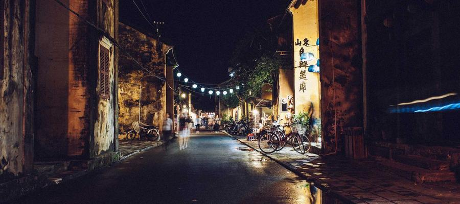
Landscape (1200 × 600)

Square (800 × 800)
Portrait / tall (600 × 900)
Panoramic / ultra-wide (1600 × 400)

Small thumbnail (200 × 200)
Images with and without captions
The image above intentionally has no caption — testing that the renderer handles empty alt text gracefully.
Images with coloured blocks

Images inside callouts
Images inside toggles
Toggle with a Notion-hosted image
Toggle with an external Unsplash image
A description paragraph after the image.
Mixed-source image gallery in columns
Notion attachment
Unsplash

Wikimedia
External images from other sources
Wikipedia / Wikimedia Commons
Placeholder services

Edge cases
Very wide image (2400 × 400)

Very tall image (400 × 1200)

Tiny image (50 × 50)

Image with text-wrap context
The following image sits between two paragraphs to test vertical spacing and how body copy flows around full-width images. This matters for the Astro renderer since editorial articles frequently alternate between prose blocks and inline imagery.
This is the paragraph immediately after the image. The renderer should produce consistent vertical margins above and below the image block, matching the rhythm of paragraph-to-paragraph spacing elsewhere on the page.
Images uploaded in HEIC
Same images converted to JPEG